corrplotpy: Visualization of a Correlation Matrix in Python with a Style Builder
Introducing corrplotpy 1.0.4 and comparing it with R corrplot 0.95
Rowan R. Terra, 2026-09-03
corrplotpy is a Python port of the R package corrplot 0.95 (Wei & Simko, 2024b) on matplotlib (Hunter, 2007), with the same functions, argument names, and defaults. The style builder below writes the Python code or the R code for a plot, and the sections after the builder cover installation, a first plot, reasons for the port, and the anatomy of a corrplot. The second tab shows the same examples in Python and in R.
Style builder
The controls set the parameters of corrplot(), the preview shows the result for the mtcars data (Henderson & Velleman, 1981), and the code under the preview draws that plot. Change the name of the CSV file, and the code is ready for other data. The type 'mixed' draws one symbol in the upper triangle and another in the lower triangle, with corrplot_mixed().
Correlation method, symbol and sequenceThe correlation method is not a parameter of corrplot(). The method selects the step that computes the matrix, df.corr(method=...). Pearson measures how near the data is to a straight line. Spearman and Kendall measure a relation between the ranks, so Spearman or Kendall fits ordered data and data with large outliers. The symbol sets the shape drawn in each cell. The type 'mixed' draws one symbol in the upper triangle and another in the lower triangle, with corrplot_mixed().
SYMBOL (method)
LOWER SYMBOL (lower)
Color and numbersThe color scale runs from -1 to +1 in every correlation plot. The scale is not a min-max scale of the matrix and not a z-score. With n palette colors counted from 1 as in R, the cell for r takes color number floor((r + 1) / 2 * n) + 1, and r = 1 takes the last color, so the value 0 is the middle color in every plot. A matrix that is not a correlation matrix needs is_corr=False and a range in col_lim. The first row of palettes is the six diverging ColorBrewer palettes of COL2() and four perceptually uniform matplotlib colormaps, viridis, cividis, plasma, and magma. The second row is the ten sequential ColorBrewer palettes of COL1(). Every ColorBrewer palette that corrplot ships has the colorblind-safe flag in ColorBrewer (Harrower & Brewer, 2003), and cividis was designed for color vision deficiency (Nuñez et al., 2018). corrplot(col='viridis') takes a matplotlib colormap by name. The reverse switch turns the palette around, so the first color is at +1.
PALETTE
NUMBERS
COLOR
Text labelsLegend and significanceFile output
corrplotpy computed the correlation matrix, p-values, reorderings, cluster sizes, and palettes that the preview uses. Circle radius, square side, and pie angle are the values that the package uses. Pearson, Spearman, and Kendall each produce a different matrix with different orderings and clusters, so the preview data includes all three matrices. A test runs the generated code through the package and checks that the code draws the matrix the preview shows.
Install
corrplotpy requires Python 3.10 or later, and it has four dependencies: numpy 1.24 or later, scipy 1.10 or later, pandas 2.0 or later, and matplotlib 3.7 or later. The tests run on Python 3.10 to 3.14 with the current releases of the dependencies and with those floors. The command below installs corrplotpy and the dependencies.
pip install corrplotpy
The first plot
corrplot() accepts a correlation matrix. A pandasDataFrame keeps the names of the variables, and corrplot() puts these names on the plot. The function returns an object, and save() writes the figure to a file.
import pandas as pd
from corrplotpy import corrplot

df = pd.read_csv('my_data.csv')
res = corrplot(df.corr())
res.save('corrplot.png', dpi=200)
Why corrplotpy
corrplot (Wei & Simko, 2024b) is an R package for displaying a correlation matrix. corrplot has approximately 50 parameters, seven symbols, four reordering algorithms, and a significance test in each cell. matplotlib and seaborn draw a heatmap of a matrix, but neither library draws the symbols, computes the orderings, or marks the cells that fail a test. Two Python implementations have the corrplot name. The Corrplot class of biokit (Cokelaer, 2021) draws eight symbols and orders by a SciPy linkage, and the corrplot function of Louridas (2013) draws ellipses and blanks cells by a p-value threshold. Neither implementation follows the R argument list or reports agreement with R output.
Switching an analysis pipeline from R to Python therefore requires writing the plot again, and the new plot does not have the same formatting. corrplotpy has a Python function for each function in corrplot 0.95, with the same argument names and defaults, and output that agrees with R within the tolerances that the second tab reports. The one change in syntax is that a dot in an R argument name is replaced with an underscore in the Python implementation.
Anatomy of a corrplot in corrplotpy
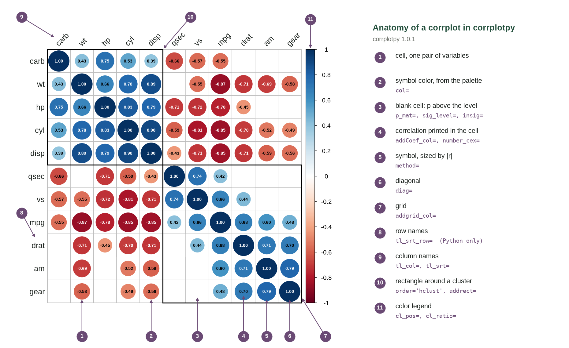
corrplot() produces one cell for each pair of variables. The symbol in the cell and the color of the symbol encode the correlation of that pair. The figure above numbers each part of one plot, and the key names the parameter that changes it. This plot uses the hierarchical sequence with two cluster rectangles, prints the correlation in each cell, and leaves a cell blank when its p-value is above 0.05.
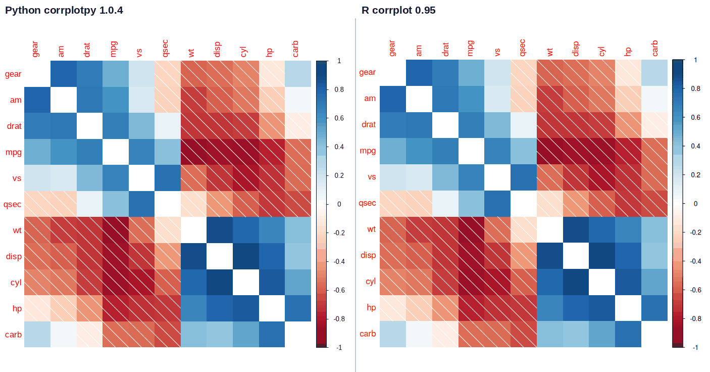
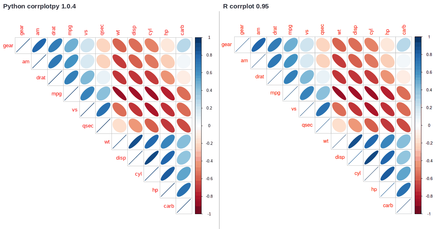
The method parameter selects one of seven symbols: circle, square, ellipse, number, shade, color, and pie. The circle and the square encode the absolute value of the correlation as an area, the ellipse as a shape, and the number as text. The color fills the cell. The shade adds white lines to the negative cells, and the pie fills clockwise for a positive value.
New functions in the Python version
Nine functions are new in corrplotpy. The style builder generates the code, and the choice of coefficient in the builder is described with the builder above. The save() method writes the figure to a file and accepts a format, a resolution, dimensions, a transparent background, and a UTC time in the file name. With utc_name=True the file name is the UTC time to the microsecond; save() creates the file exclusively and moves to a counter when the name exists, so the call does not write over an earlier file.
The font_family parameter selects the font. When the requested font is not installed, corrplotpy substitutes a metric-compatible font where one exists, Liberation Sans for Arial, Carlito for Calibri, and Liberation Serif for Times New Roman. The label space then stays close to the original, although the exact text extent still depends on the installed font. Without a metric match, the fallback is the installed sans-serif font, and the layout can differ from R's. The pointsize parameter sets the base font size, and tl_cex, number_cex, and cl_cex each scale one group of text.
R rotates the column names with tl.srt and keeps the row names horizontal. corrplotpy adds tl_srt_row, so the row names can take a separate angle. The default of 0 degrees reproduces the R layout.
addCoef_col='auto' selects black or white for each printed number. The renderer takes the color under the number (the symbol color when the symbol is wider than the text, the cell background otherwise), computes the WCAG 2.1 contrast ratio against black and against white, and selects the higher. A number on a dark cell is then white, and a number on a pale cell is black. R accepts one color for every number.
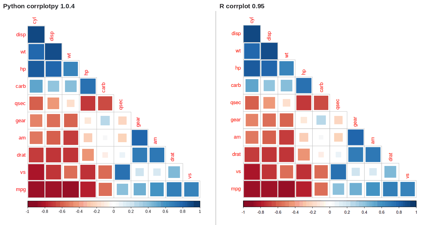
With type='upper' or type='lower', R draws no cluster rectangles. corrplotpy draws the outline of the shown cells of each cluster, a stepped triangle, when addrect is set with either type. The function cluster_outline() returns the vertices of one outline. In corrplot_mixed(), where both triangles are shown, addrect outlines each cluster once with the rectangle over the whole block.
The col parameter accepts a matplotlib colormap by name or as an object, so col='cividis' selects the colormap designed for color vision deficiency (Nuñez et al., 2018), and the style builder offers viridis, cividis, plasma, and magma. The colormap is sampled at 200 colors, the length of the default palette. Every ColorBrewer palette in COL1() and COL2() has the colorblind-safe flag in ColorBrewer (Harrower & Brewer, 2003).
With insig='label_sig', R draws the significance marks at the cell center in one color, over any printed number. corrplotpy moves the marks up when a number is printed in the cell, and pch_col='auto' prints each mark in black or white by the same contrast rule as addCoef_col='auto'.
save() parameter
Default
Function
format
'png'
The file format: 'png', 'svg', 'pdf', or another format of matplotlib. The extension of the path also sets it.
dpi
200
The dots for each inch. It changes the pixel count of a PNG. A vector format does not use it.
size
None
The dimensions of the written image in inches as (width, height); the figure returns to its own size afterwards.
transparent
False
True writes the file with no background, in any format that stores transparency; False keeps the figure's background.
utc_name
False
True adds the UTC time to the file name, to the microsecond, in the form corr_20260902T143005.123456Z.png, and adds a counter if that name is taken.
res = corrplot(df.corr(), method='ellipse', font_family='Times New Roman')

res.save('figure.png', dpi=300)              # a raster file
res.save('figure.pdf')                       # a vector file
res.save('figure.svg', transparent=True)     # no background
res.save('figure.png', size=(10, 8), utc_name=True)
# figure_20260902T143005.123456Z.png
corrplot() has approximately 50 parameters. The table lists the parameters that change the plot the most. The name of each parameter is the R name with an underscore in the place of each dot.
Parameter
Default
Function
method
'circle'
The symbol in each cell: 'circle', 'square', 'ellipse', 'number', 'shade', 'color', or 'pie'.
type
'full'
The part of the matrix: 'full', 'upper', or 'lower'.
order
'original'
The sequence of the variables: 'original', 'AOE', 'FPC', 'hclust', or 'alphabet'.
diag
True
Show the diagonal, or hide it with False.
addrect
None
The number of clusters to outline. It needs order='hclust'.
col
None
The colors, from COL2() for a diverging palette or COL1() for a sequential palette, or the name of a matplotlib colormap such as 'viridis'.
is_corr
True
Set is_corr to False for a matrix that is not a correlation matrix, and set col_lim to the range of the values.
tl_col, tl_srt, tl_cex
'red', 90, 1
The color, angle, and size of the text labels. tl_srt turns the column names.
tl_pos, tl_srt_row
None, 0
Where the text labels go, and the angle of the row names. tl_pos of None selects 'lt' for a full plot, 'td' for an upper plot, and 'ld' for a lower plot, which puts one group of names on the diagonal. tl_srt_row is not in R.
cl_pos, cl_ratio
None, 0.15
The position and the width of the color legend. 'r' is at the right, 'b' is below, and 'n' removes it.
addCoef_col, number_cex
None, 1
The color and the size of the correlation number in each cell. 'auto' is not in R; 'auto' selects black or white for each number, whichever reads better on the color under the number.
col_lim
None
The range that the palette covers. The color scale is fixed from -1 to +1; the scale is not a min-max scale and not a z-score. For a matrix that is not a correlation matrix, set is_corr=False and set col_lim.
p_mat, sig_level, insig
None, 0.05, 'pch'
The p-values, the level, and what to do with the cells above the level: 'pch', 'p-value', 'blank', 'n', or 'label_sig'.
plotCI, lowCI_mat, uppCI_mat
'n', None, None
Show the confidence interval in each cell as 'rect', 'circle', or 'square'.
na_label, na_label_col
'?', 'black'
The label for a cell that has no number, and its color.
mar, figsize, pointsize
(0, 0, 0, 0), (7, 7), 12
The margins in lines of text, the figure dimensions in inches, and the font size.
Complete examples
Each example below is complete code, and the plot beside the code is what that code drew when this page was built. All of the examples start from the setup block, in which df is a DataFrame with one variable in each column and tests is the p-value table for df.
import pandas as pd
from corrplotpy import corrplot, corrplot_mixed, cor_mtest, mtcars

df = mtcars()                # or pd.read_csv('my_data.csv')
tests = cor_mtest(df, conf_level=0.95)
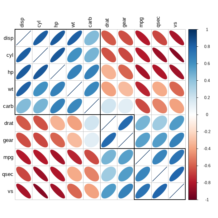
Cluster the variables and put a rectangle around each cluster
res = corrplot(df.corr(), order='hclust', addrect=3,
               method='color', tl_col='black')
res.save('clusters.png', dpi=200)
Hide the correlations that fail the significance test
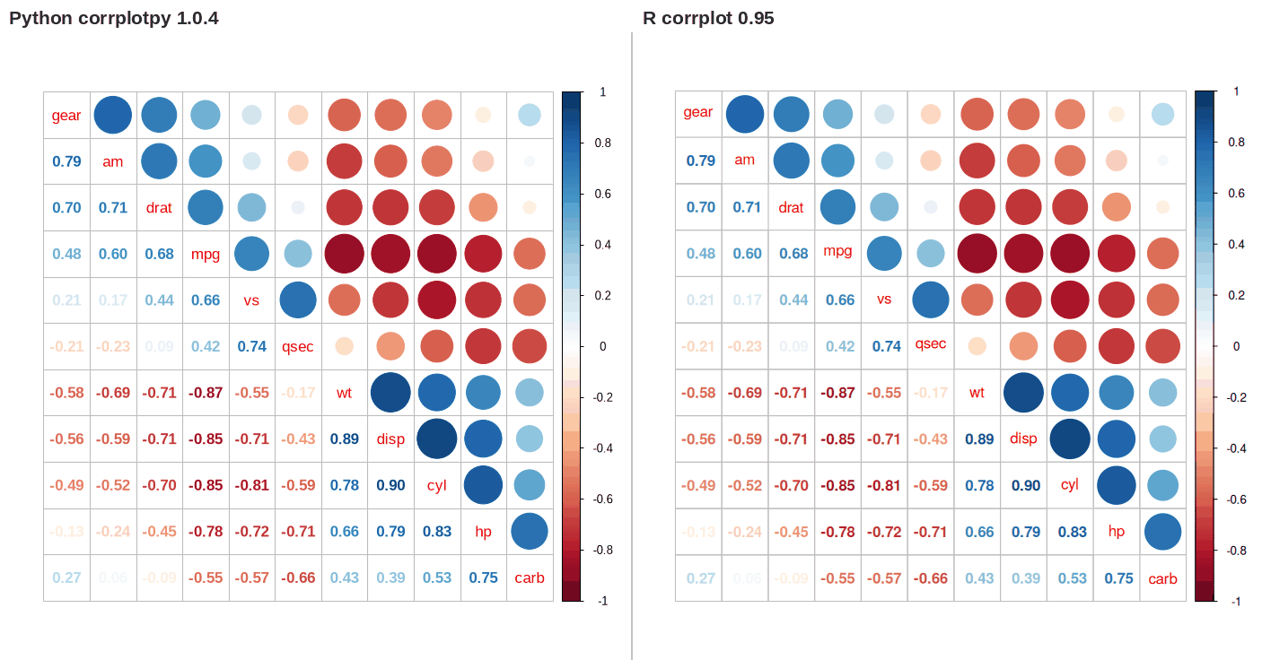
res = corrplot_mixed(df.corr(), lower='ellipse', upper='number',
                     number_cex=0.7)
res.save('mixed.png', dpi=200)
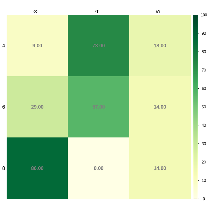
A matrix that is not a correlation matrix
from corrplotpy import COL1

# the share of cars in each gear count, by cylinder count
share = pd.crosstab(df['cyl'], df['gear'], normalize='index') * 100
res = corrplot(share.round(0), is_corr=False, col_lim=(0, 100),
               method='color', col=COL1('YlGn', 200),
               addCoef_col='grey50', tl_col='black')
res.save('share.png', dpi=200)
Add text to the plot after corrplot draws it
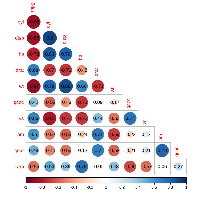
res = corrplot(df.corr(), type='lower', diag=False)
cells = res.corrPos                 # one row for each cell
res.canvas.text(cells['x'], cells['y'],
                cells['corr'].round(2))
res.save('with_numbers.png', dpi=200)
Use the same style for many datasets
STYLE = dict(method='ellipse', order='hclust', addrect=3,
             tl_col='black', cl_ratio=0.2)
cars = df.drop(columns='am')       # am is constant in each subset
datasets = {'all': cars, 'manual': cars[df['am'] == 1],
            'automatic': cars[df['am'] == 0]}

for name, frame in datasets.items():
    corrplot(frame.corr(), **STYLE).save(name + '.png', dpi=200)
Return value
corrplot() returns an object with the parts in the table. With the cell table, code can add text or symbols to the plot after corrplot() draws the plot.
Part
Content
res.corr
The matrix in the sequence of the plot, as a DataFrame.
res.corrPos
One row for each cell: xName, yName, x, y, corr, and p.value when the plot has p-values.
res.arg
The arguments that corrRect() needs.
res.fig, res.ax
The matplotlib figure and axes.
res.canvas
The drawing surface, for text and symbols on top of the plot.
Verification
Both languages render each figure at the same size, 7 by 7 inches at 100 dpi with a 12 point font, with R version 4.3.3 and corrplot 0.95 on 2026-09-03. The comparison script placed the two plots side by side, added the labels and the divider, and reduced the combined PNG to a 192-color palette for the page; neither plot was retouched or rescaled. The table lists each comparison and the agreement or discrepancy found. Every number in the table comes from a file that the comparison script wrote; docs/r_environment.json records the platform, locale, and BLAS/LAPACK libraries.
Check
What it compared
Result
Cell tables
The names, coordinates, correlations, and p-values of each drawn cell, for the 32 of the 40 vignette figures that return one
32 of 32 agree; largest difference 5.1e-15
Second set of examples
24 more calls that the vignette does not contain
24 of 24 agree; largest difference 7.8e-16
Correlation tests
cor_test() against R's cor.test() over 594 cases: sample sizes 5 to 100, three methods, three alternatives, exact and asymptotic, with and without ties, with and without the continuity correction
594 of 594 agree within 1.0e-12; largest p-value difference 6.8e-14
Arguments
Every named argument of the nine R functions, read with formals(), against the Python signature
90 of 90 present with the same default; the 5 dots arguments become keywords
Test suite
The package against stored R output, with no R installation
252 of 253 pass
Figures without a cell table
The scripts do not compare the other 8 of the 40 vignette figures. Six end in a legend, rectangles, or text drawn on an existing plot and return no table, and the ordering of the other two comes from the seriation package
8 of 40, compared by eye only
Setup
Install the package with pip install corrplotpy. Each example below starts from the code in this block, which imports the function, reads the mtcars data (Henderson & Velleman, 1981), and calculates the correlation matrix. The R block does the same with library() and cor().
PYTHON
from corrplotpy import (corrplot, corrplot_mixed, corrMatOrder,
                        corrRect, corrRect_hclust, colorlegend,
                        cor_mtest, COL1, COL2, mtcars)

M = mtcars().corr()
testRes = cor_mtest(mtcars(), conf_level=0.95)
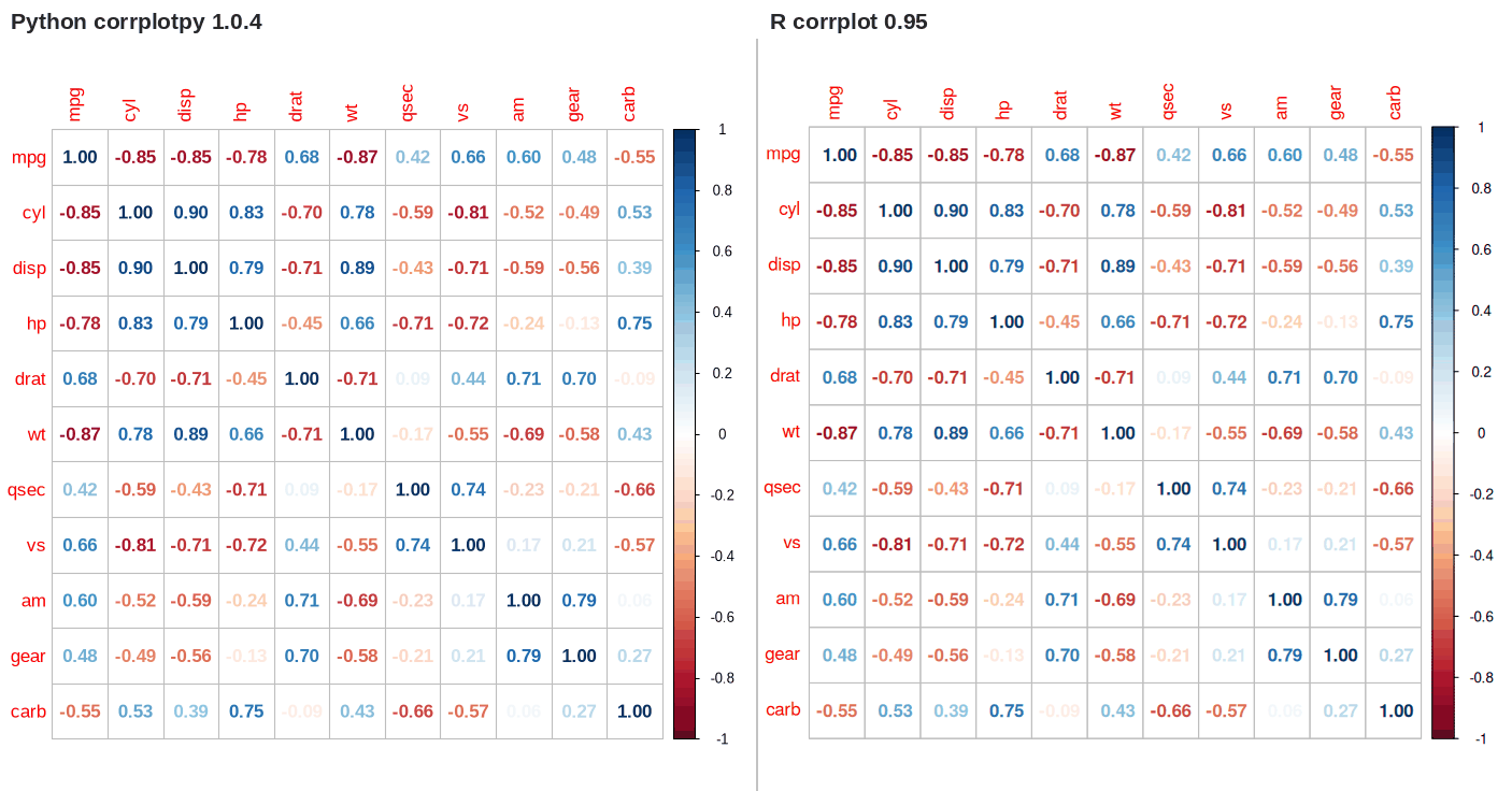
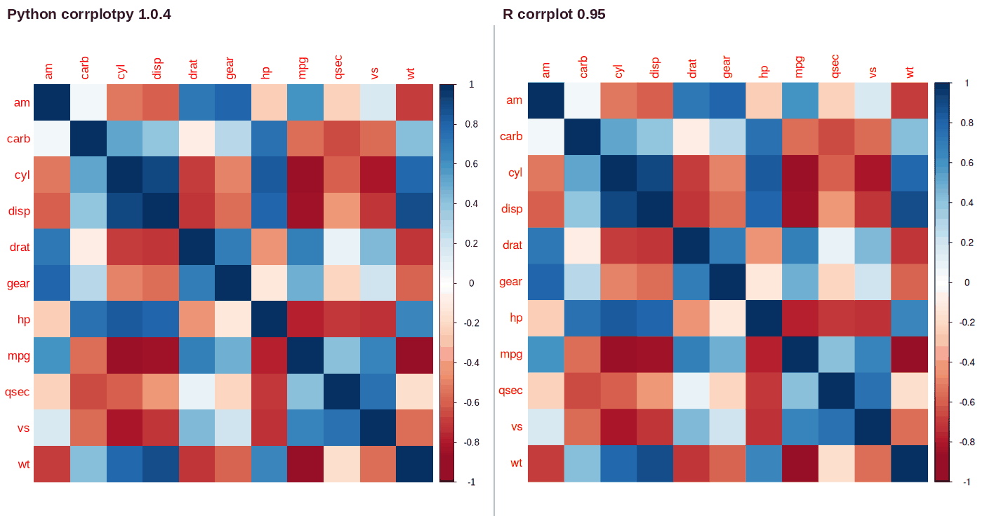
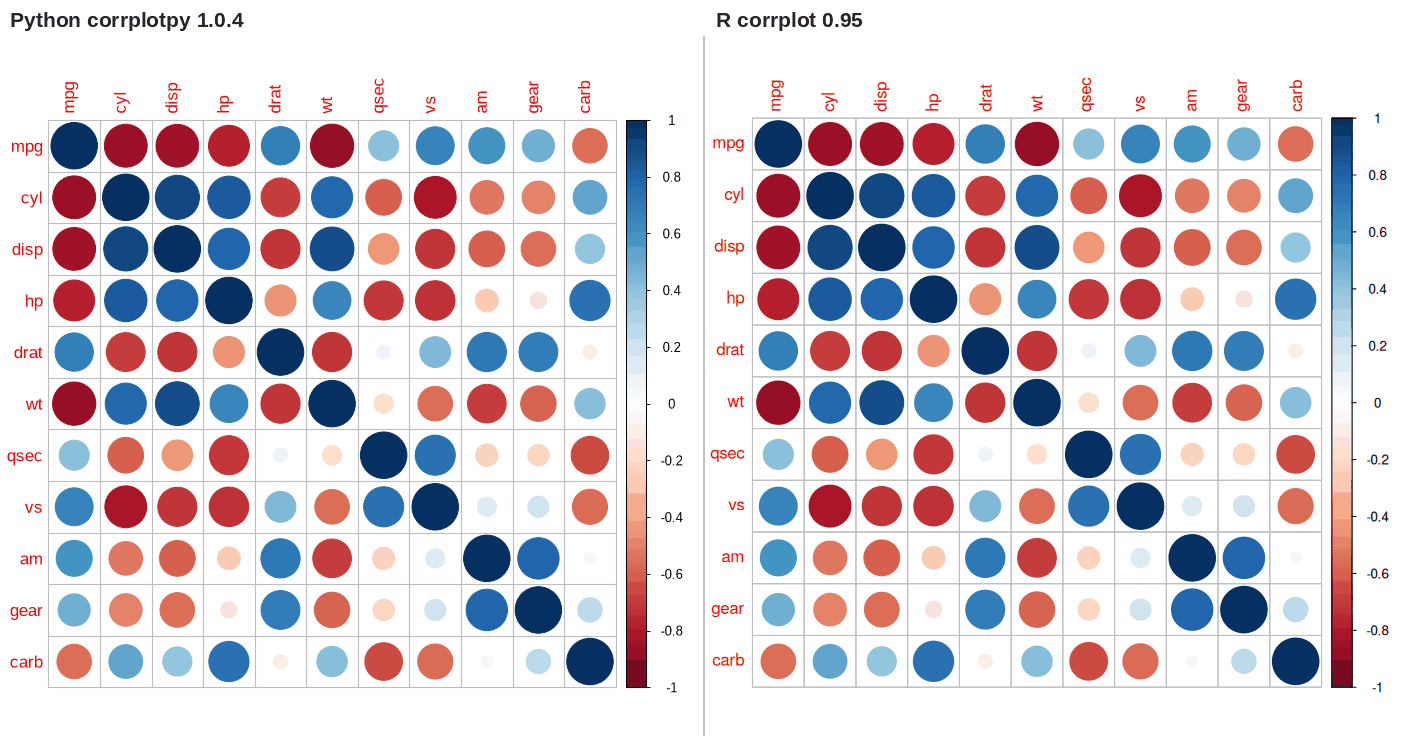
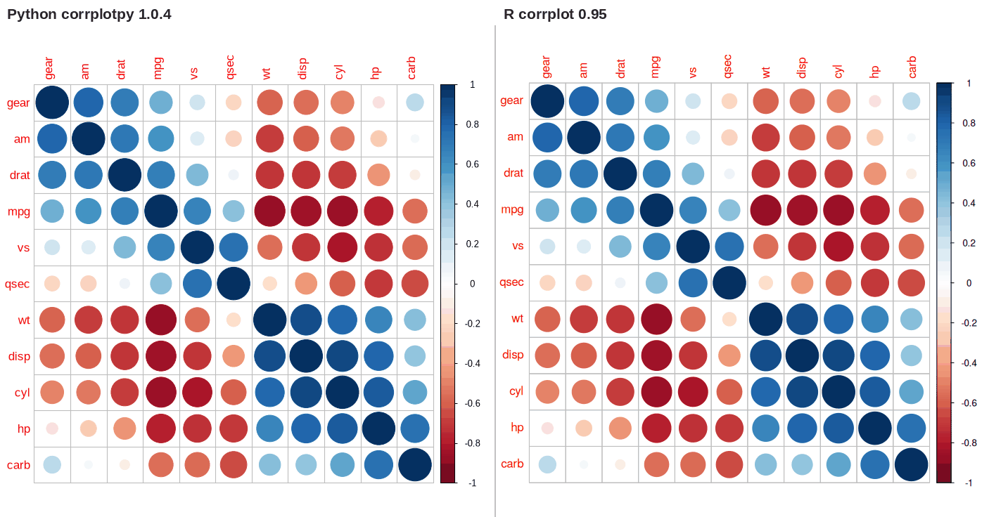
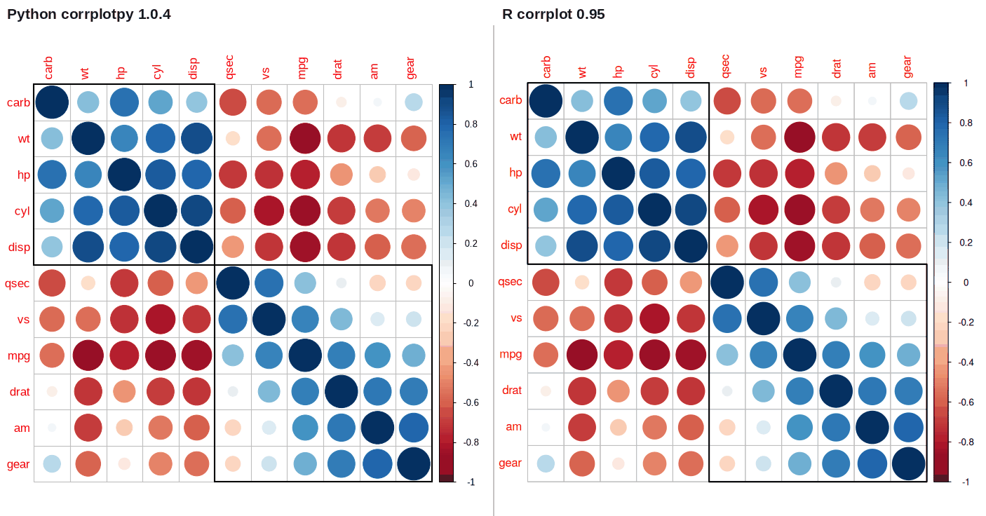
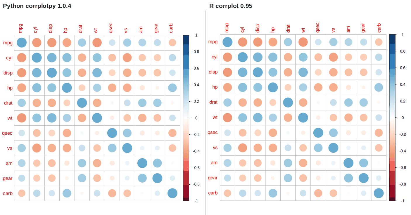
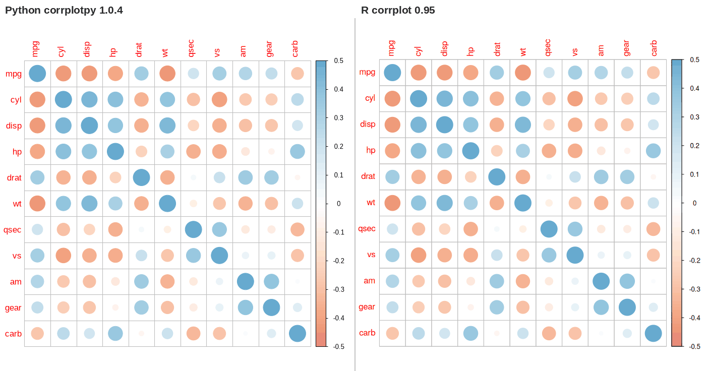
These comparisons come from the vignette of the R package. Each panel below is one group of features. Open a panel to see the Python code, the R code, and both figures. corrplotpy draws the left figure, and R corrplot 0.95 draws the right figure.
Symbols and layout9 examples
These examples change the symbol and the layout. method selects the symbol, type selects the full matrix or one triangle, and diag shows or hides the diagonal.
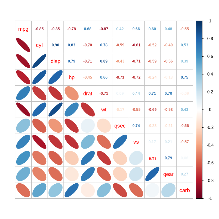
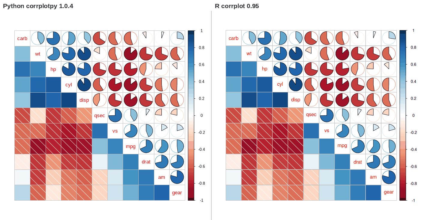
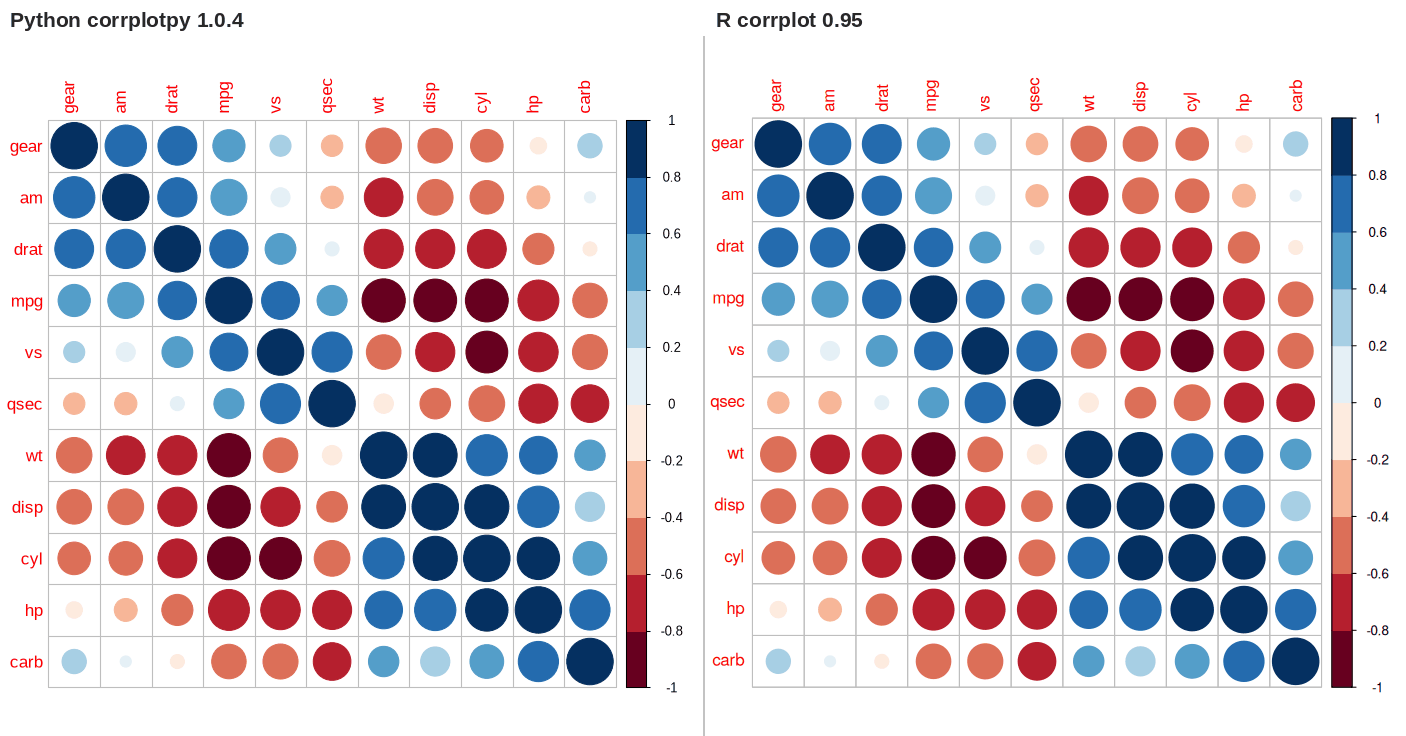
The pie fills clockwise for a positive value and counterclockwise for a negative value. The function corrplot_mixed() draws a different symbol in each half of the matrix.
corrplot.mixed(M, lower = 'shade', upper = 'pie', order = 'hclust')
Reorder a correlation matrix2 examples
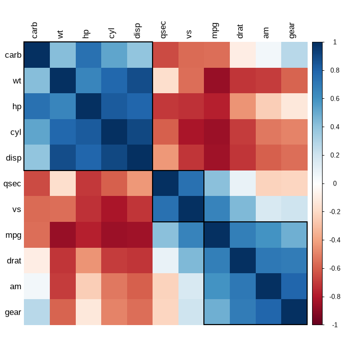
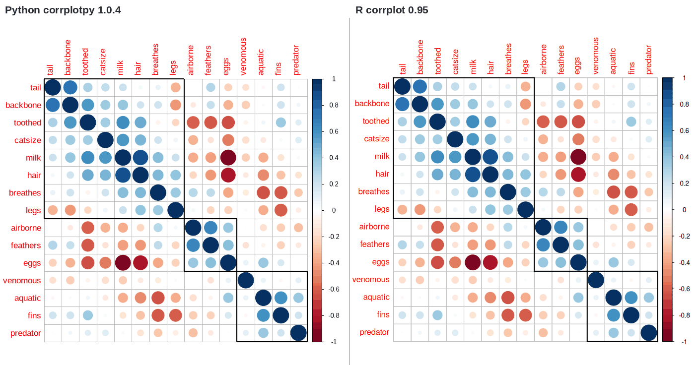
The order parameter puts the variables in a new sequence, and corrplot has four: AOE from the angles of the first two eigenvectors, FPC from the first principal component, hclust from the leaves of a dendrogram of the distance 1 minus corr, and alphabet from the names of the variables.
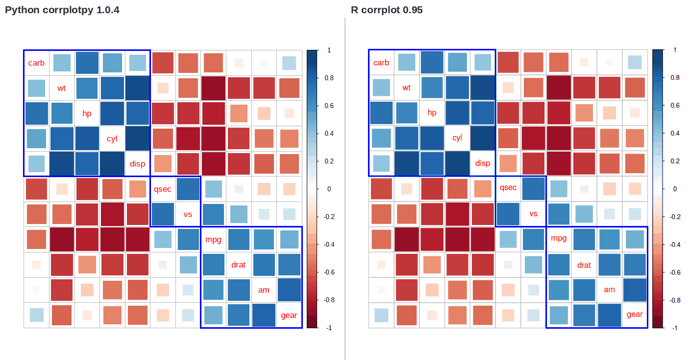
When the order is hclust, the addrect parameter draws rectangles around the clusters. The hclust_method parameter selects the linkage. R accepts nine linkage names, of which ward and ward.D select the same method, and corrplotpy reproduces R's leaf sequence for every linkage name on the test matrices.
The AOE sequence and the FPC sequence depend on the signs of the eigenvectors, and LAPACK leaves those signs arbitrary. The same matrix can therefore order in the opposite direction on a computer with a different LAPACK. corrplotpy takes the signs from LAPACK, as R does. The parameter eigen_sign = 'max_abs' normalizes the signs instead, which removes that reversal; a matrix with repeated eigenvalues can still order differently.
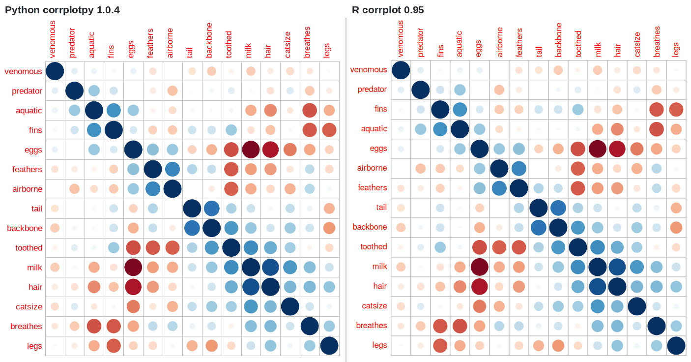
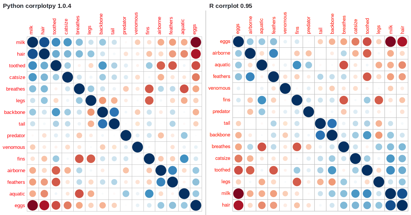
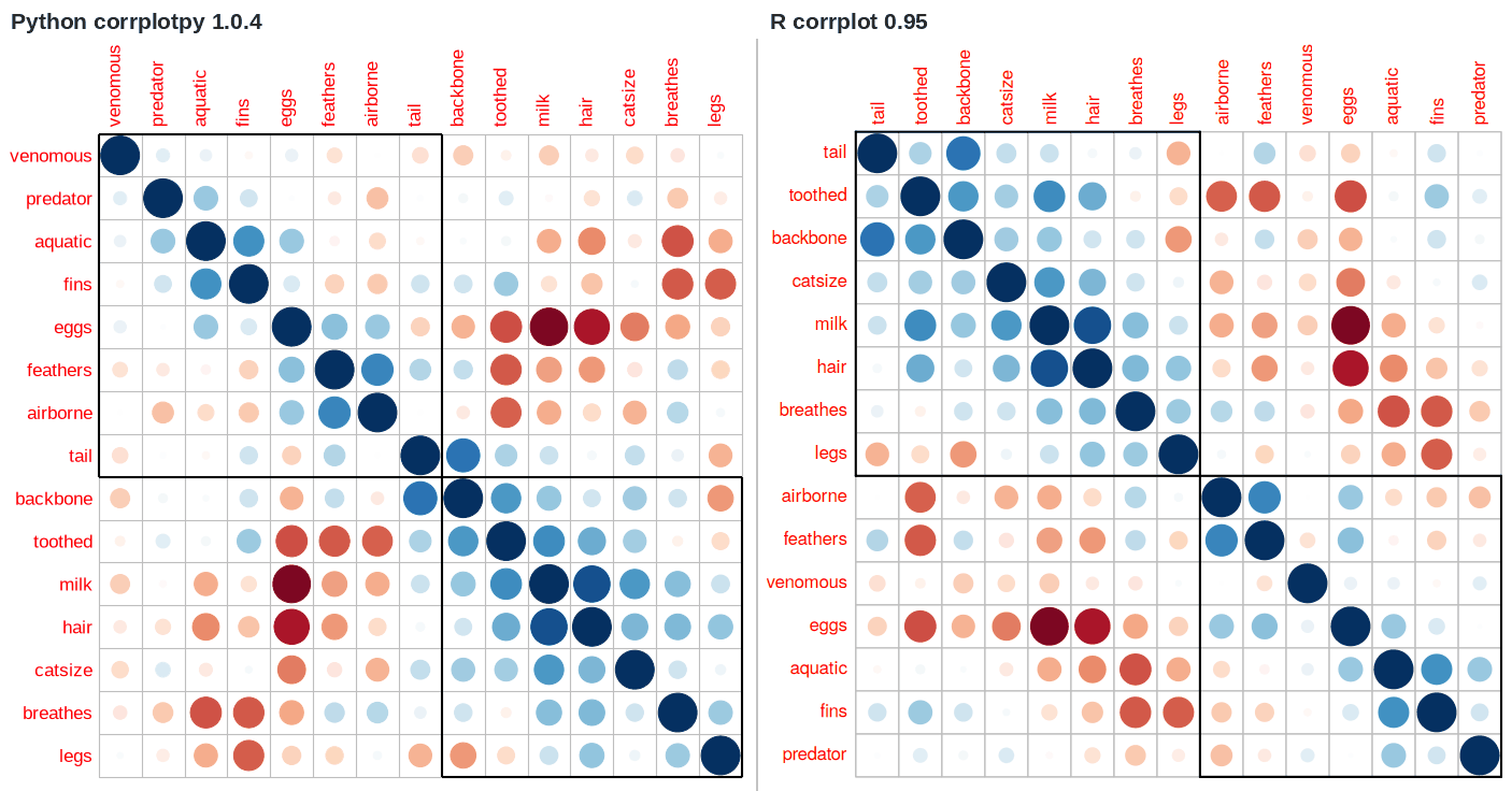
corrplot accepts the matrix in the sequence that the user supplies. The R vignette uses the seriation package (Hahsler et al., 2008) to calculate a sequence. The data for these two examples is the Zoo data set (Forsyth, 1990), which the seriation package contains. Python reads the data from a CSV file that R wrote.
SciPy has the optimal leaf ordering algorithm. The spectral algorithm is the Fiedler vector of the Laplacian matrix, which takes a few lines of code in each language. The other algorithms in the seriation package have no equivalent in Python.
This documentation compares the cell tables of all the examples, but not of these two figures. Their sequence comes from other software, not from corrplot. The two languages use the same objective and the same linkage. The sequences agree, but two adjacent variables can change position when more than one sequence is optimal.
PYTHON
def olo_order(corr):
    """Optimal leaf ordering, seriation's default linkage."""
    d = squareform(1 - np.asarray(corr), checks=False)
    z = linkage(d, method='complete')
    return leaves_list(optimal_leaf_ordering(z, d))


def spectral_order(corr):
    """Fiedler vector of the similarity graph Laplacian."""
    w = np.asarray(corr, dtype=float).copy()
    np.fill_diagonal(w, 0.0)
    w = w - w.min()
    lap = np.diag(w.sum(axis=1)) - w
    _, vecs = np.linalg.eigh(lap)
    return np.argsort(vecs[:, 1])
The function corrRect() draws rectangles on a plot. The rectangles are specified as index numbers, as variable names, or as two corners. corrRect() reads the object that corrplot() returns. The Python code passes that object as an argument; the R code passes the object through a pipe.
PYTHON
# hierarchical order here, R2E has no Python counterpart
i = olo_order(Z)
corrRect(corrplot(Z.iloc[i, i], cl_pos='n'), index=[1, 9, 15])
R
# Rank-two ellipse seriation, use index parameter
i <- dist2order(Z, 'R2E')
corrplot(Z[i, i], cl.pos = 'n') |> corrRect(c(1, 9, 15))
The two sequences are different, because the two algorithms are different. This pair compares the rectangles.
r <- rbind(c('eggs', 'catsize', 'airborne', 'milk'),
           c('catsize', 'eggs', 'milk', 'airborne'))
corrplot(Z, order = 'hclust') |> corrRect(namesMat = r)
Change color spectra, color-legend and text-legend8 examples
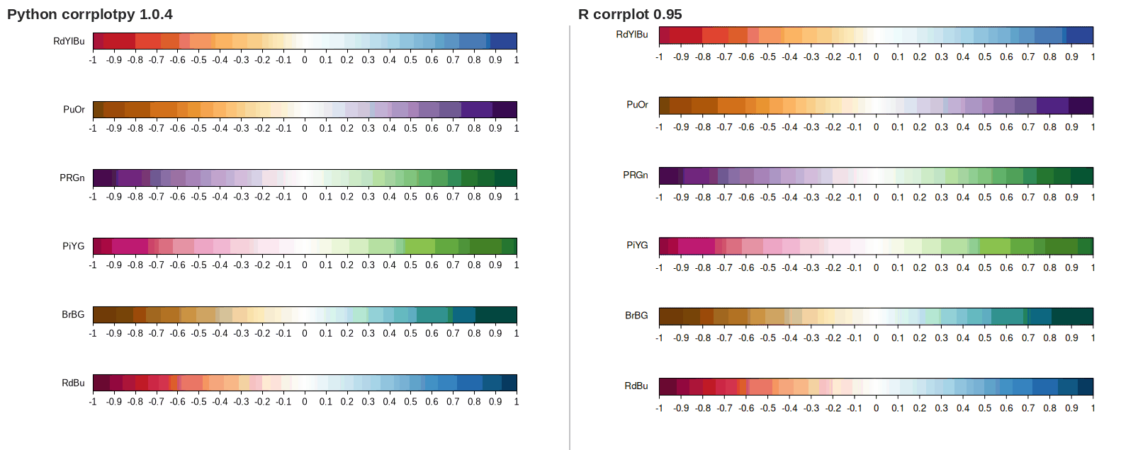
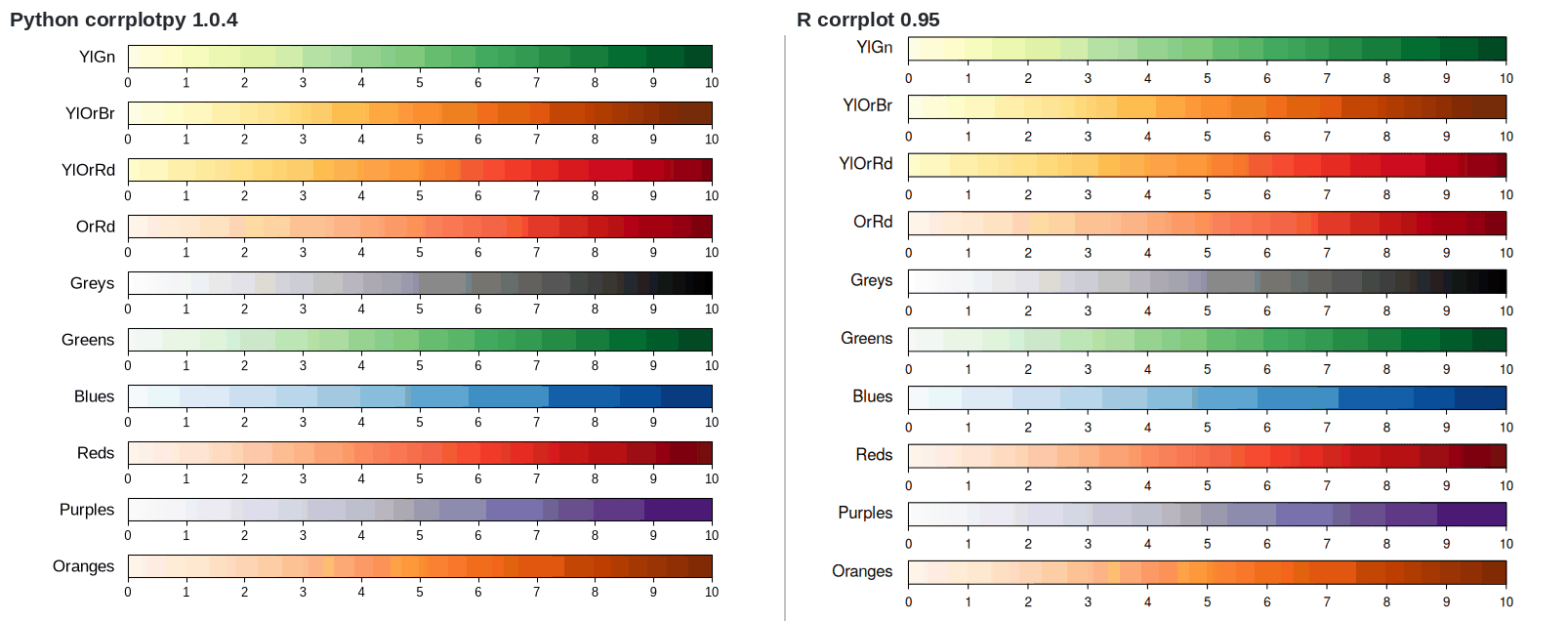
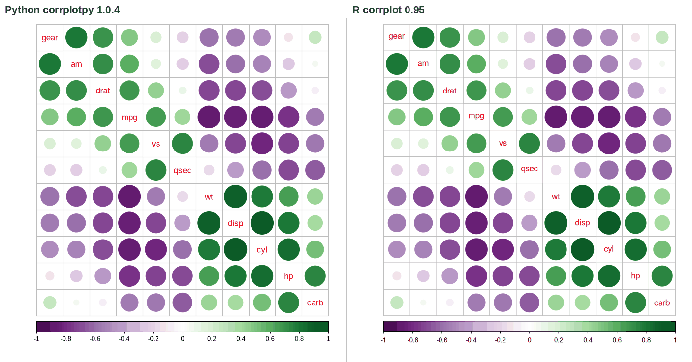
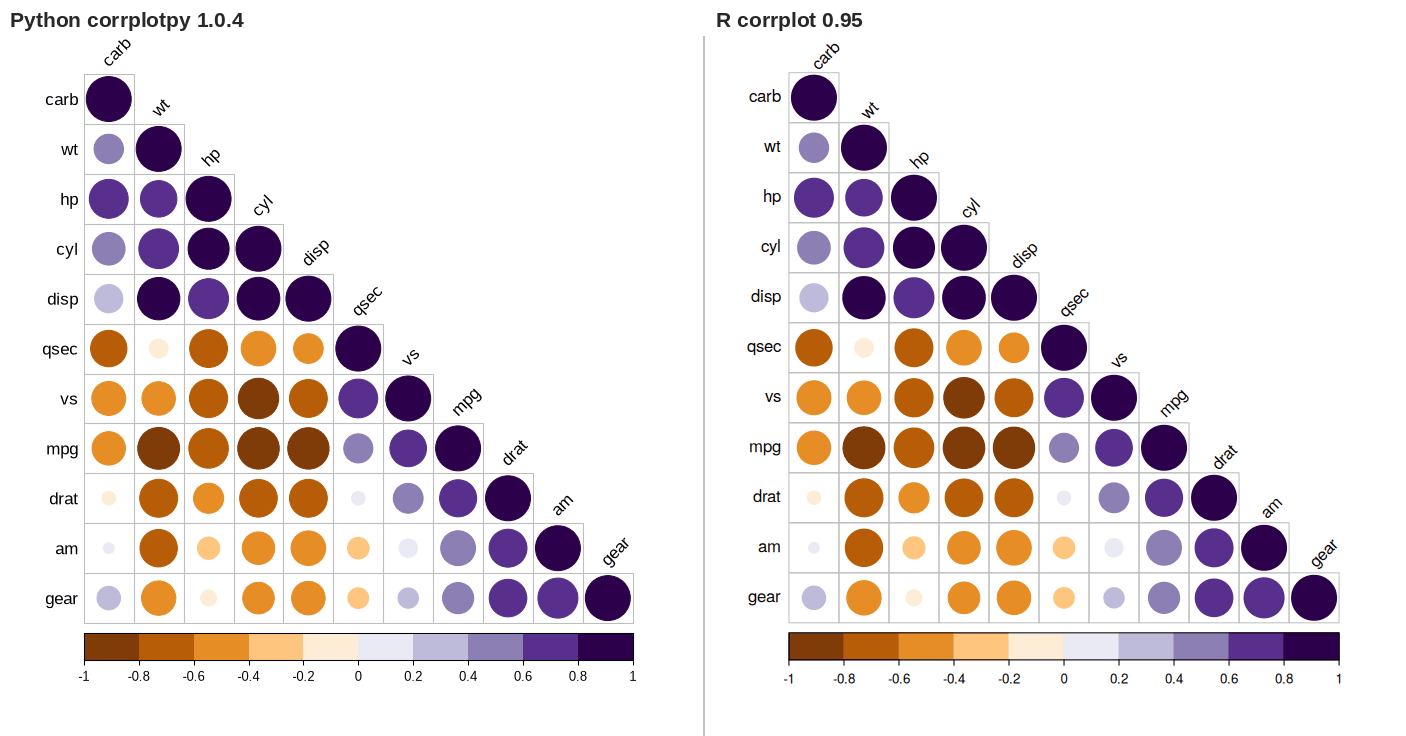
COL2() has six diverging palettes. COL1() has ten sequential palettes. Each function returns n colors. The two charts below show all the palettes; the function colorlegend() draws them. For every palette at n = 7 and n = 200, the Python hexadecimal codes agree with the codes recorded from R, color by color, which the test suite checks.
The cl_pos parameter moves the color legend. The tl_pos parameter and the tl_srt parameter move and turn the text labels. The value 'n' removes the legend or the labels.
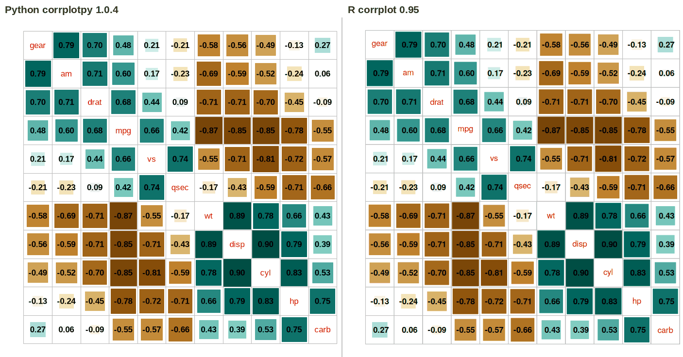
corrplot(M, method = 'square', order = 'AOE', addCoef.col = 'black',
         tl.pos = 'd', cl.pos = 'n', col = COL2('BrBG'))
PYTHON
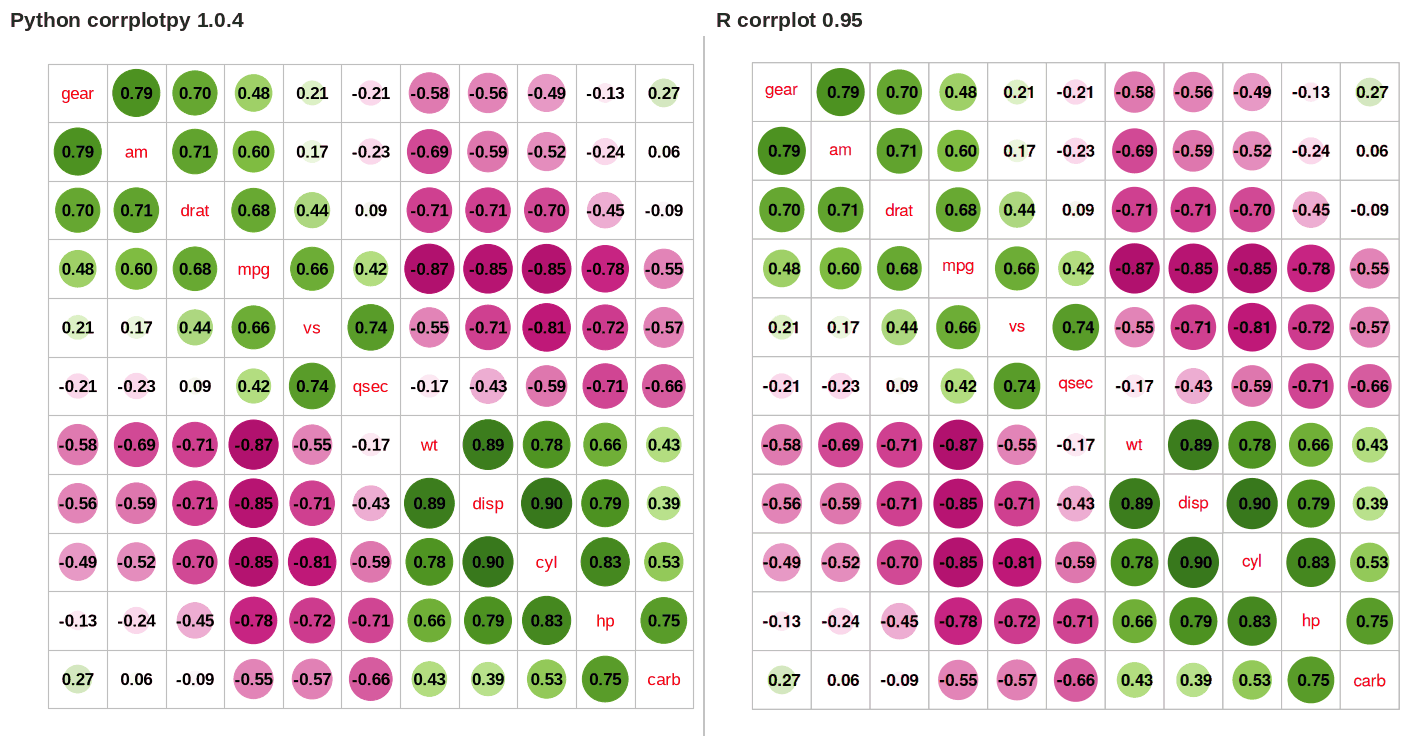
## bottom color legend, diagonal text legend, rotate text label
corrplot(M, order='AOE', cl_pos='b', tl_pos='d',
         col=COL2('PRGn'), diag=False)
R
## bottom color legend, diagonal text legend, rotate text label
corrplot(M, order = 'AOE', cl.pos = 'b', tl.pos = 'd',
         col = COL2('PRGn'), diag = FALSE)
PYTHON
## text labels rotated 45 degrees, wider color legend
corrplot(M, type='lower', order='hclust', tl_col='black',
         cl_ratio=0.2, tl_srt=45, col=COL2('PuOr', 10))
R
## text labels rotated 45 degrees, wider color legend
corrplot(M, type = 'lower', order = 'hclust', tl.col = 'black',
         cl.ratio = 0.2, tl.srt = 45, col = COL2('PuOr', 10))
PYTHON
## remove color legend, text legend and principal diagonal glyph
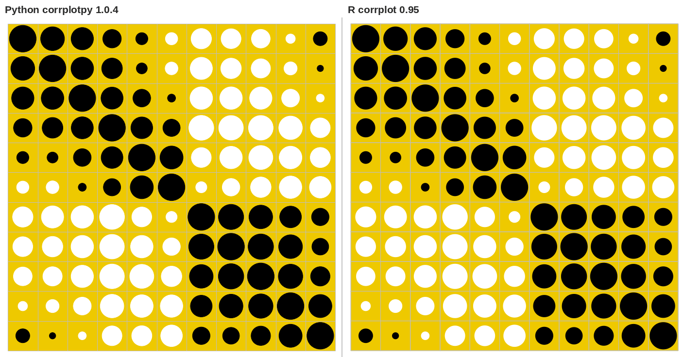
corrplot(M, order='AOE', cl_pos='n', tl_pos='n',
         col=['white', 'black'], bg='gold2')
R
## remove color legend, text legend and principal diagonal glyph
corrplot(M, order = 'AOE', cl.pos = 'n', tl.pos = 'n',
         col = c('white', 'black'), bg = 'gold2')
Visualize non-correlation matrix, NA value and math label7 examples
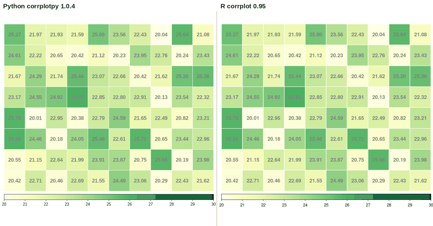
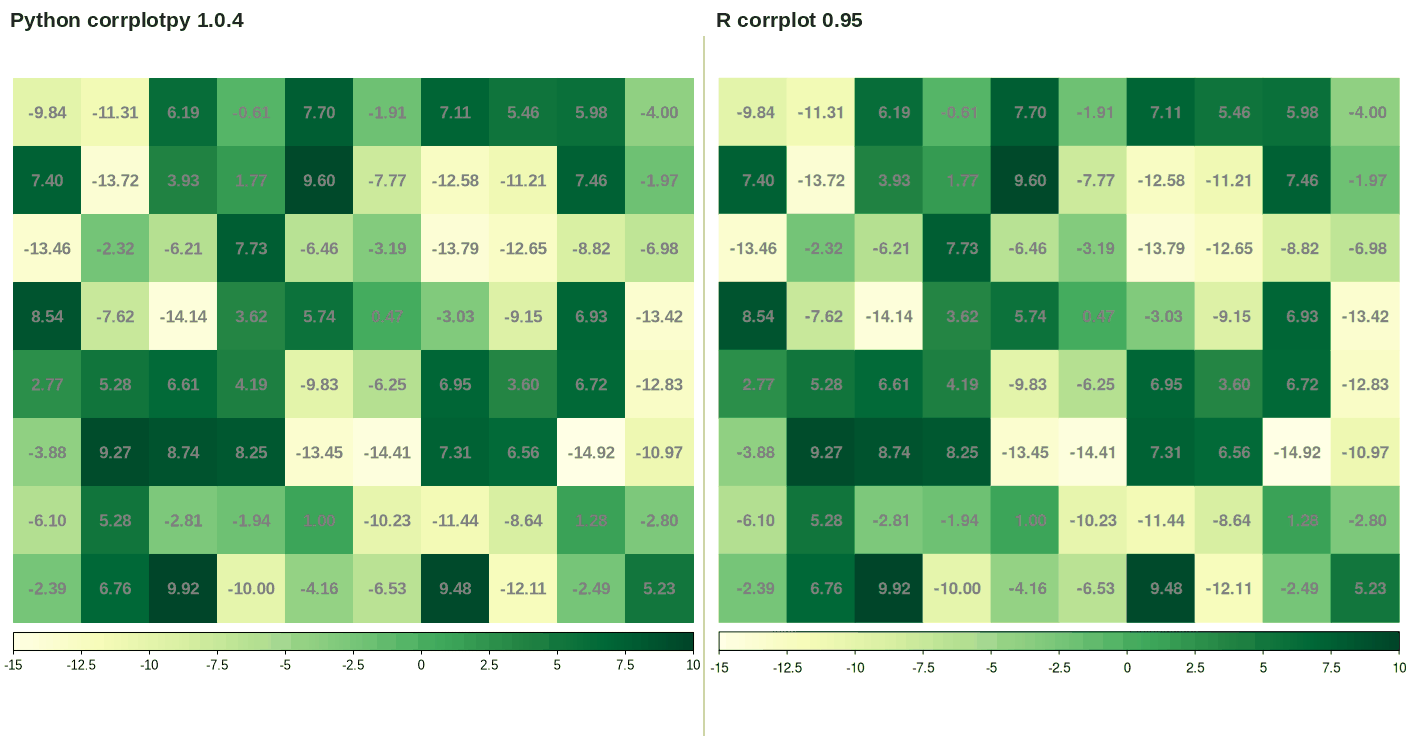
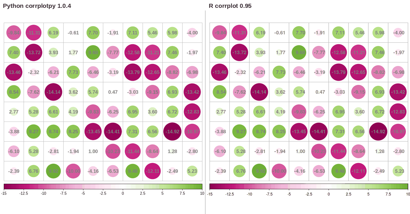
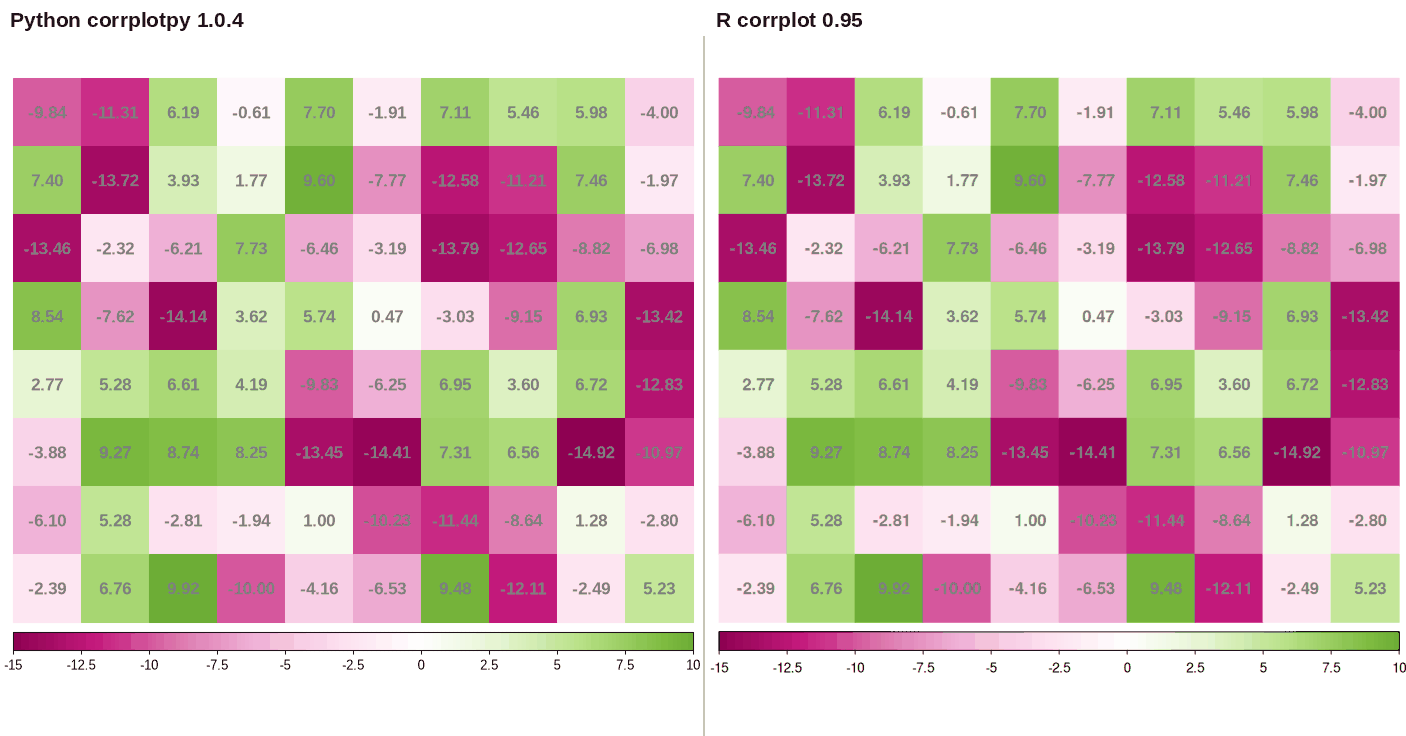
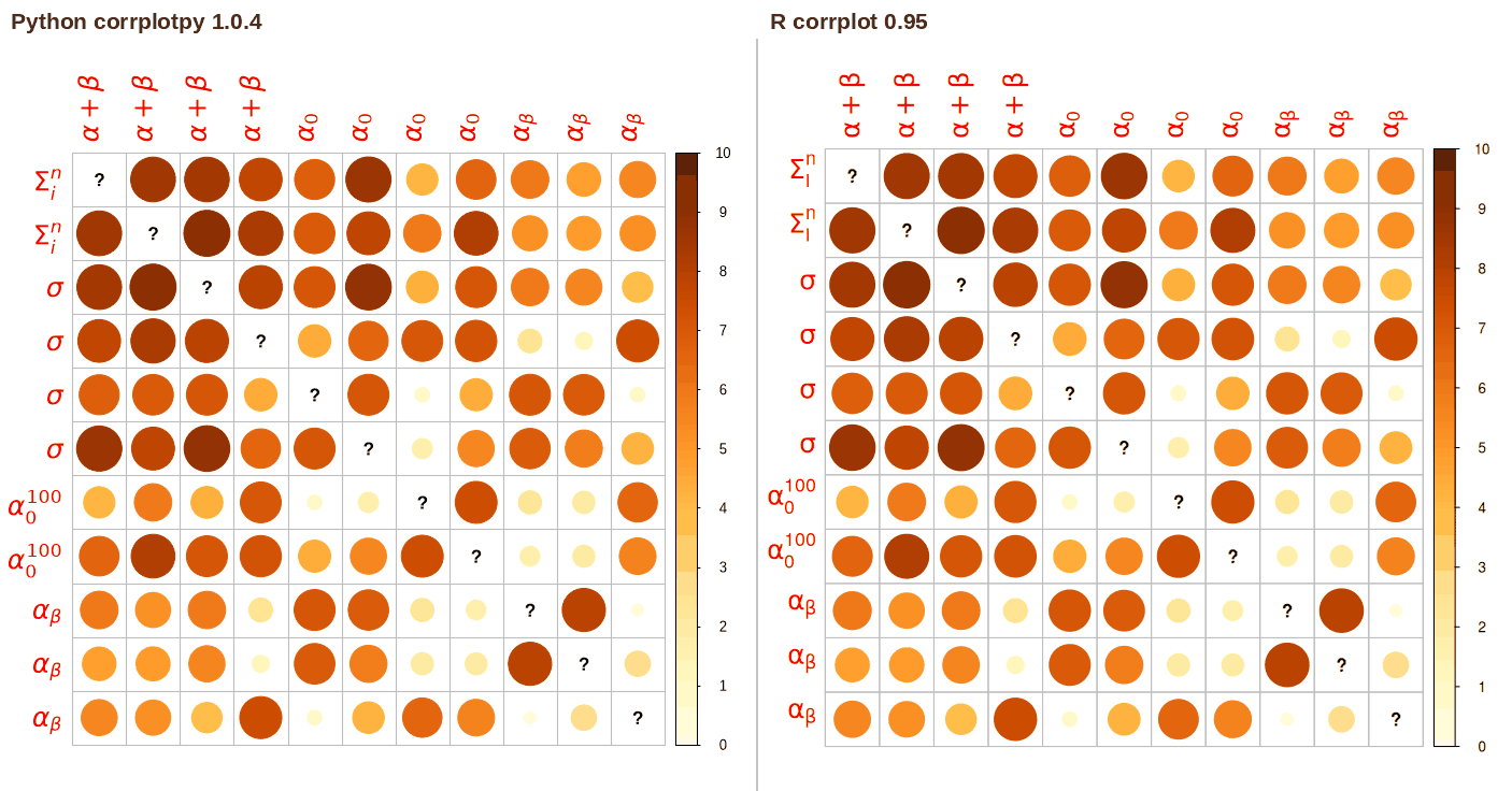
The parameter is_corr = False shows a matrix that is not a correlation matrix. The col_lim parameter sets the interval of the colors. A matrix with positive values and negative values keeps the sign of each value. The parameter transKeepSign = False stops this behavior. When is_corr is True, col_lim changes only the legend.
For a cell that has no number, corrplot draws a label instead of a symbol. The default label is a question mark, and a label has at most two characters. A variable name that starts with a dollar sign is a plotmath expression in R. corrplotpy translates the expression into matplotlib mathtext.
PYTHON
## matrix in [20, 26], grid color
corrplot(N1, is_corr=False, col_lim=(20, 30), method='color',
         tl_pos='n', col=COL1('YlGn'), cl_pos='b',
         addgrid_col='white', addCoef_col='grey50')
Visualize p-value and confidence interval9 examples
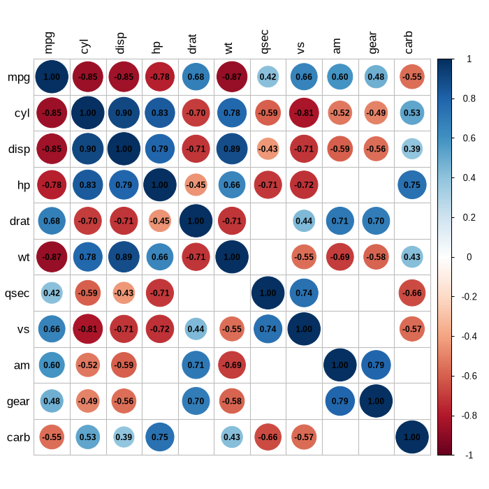
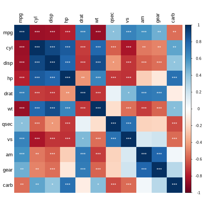
The function cor_mtest() tests each pair of columns and returns the p-values and the confidence limits. The p_mat parameter passes the p-values to corrplot. The insig parameter selects what corrplot does with a cell whose p-value is above the level.
cor_test() follows R's cor.test(). Pearson uses the t statistic and the Fisher z interval. Kendall uses R's exact distribution below n = 50 without ties, and R's tie-corrected z statistic otherwise. Spearman uses exact enumeration through n = 9, the Edgeworth series of Best and Roberts (1975) for 10 <= n <= 1290, and the t approximation above that. Over the recorded grid of cases, the p-values agree with R to the tolerance in the verification table.
The plotCI parameter shows the confidence interval in each cell. R finds an argument name from a prefix, but Python does not. The Python code thus uses the full names plotCI, lowCI_mat, and uppCI_mat.
PYTHON
## mark the insignificant values at the chosen level
corrplot(M, p_mat=testRes['p'], sig_level=0.10, order='hclust',
         addrect=2)
R
## specialized the insignificant value according to the significant level
corrplot(M, p.mat = testRes$p, sig.level = 0.10, order = 'hclust',
         addrect = 2)
The AOE sequence and the FPC sequence can come out reversed. Both use the signs of the first two eigenvectors, and LAPACK leaves those signs arbitrary, so the result depends on the LAPACK build. The parameter eigen_sign = 'max_abs' normalizes the signs, which removes the reversal; a matrix with repeated eigenvalues can still order differently.
corrplotpy translates plotmath, but it does not do all of plotmath. The translation includes Greek names, subscripts, superscripts, sqrt, frac, the font functions, and the usual operators. Other expressions stay as text.
Python has no equivalent of the R dots argument. corrplotpy has a keyword argument for each parameter. Python also does not complete an argument name or an argument value from a prefix, where R's match.arg accepts 'ell' for 'ellipse', so plotC becomes plotCI, lowCI becomes lowCI_mat, and method = 'ellipse' is spelled out.
corrMatOrder() always returns positions that start at 0. For order = 'alphabet', R returns names. The alphabetical order follows Python's string comparison; R's follows the locale.
Text layout depends on the installed fonts. corrplotpy prefers a font with the metrics of Helvetica, which is what the R device measures with, and takes the first installed font from Nimbus Sans, Helvetica, Arial, Liberation Sans, and FreeSans. Without one of those, corrplotpy falls back to an installed sans-serif font, usually DejaVu Sans, which is wider, so the space around the labels changes. The comparisons in this document were rendered with Liberation Sans on both sides.
corrplotpy draws each R pch symbol with the nearest matplotlib marker and centers text for an adj value other than 0, 0.5, and 1. Both are close approximations of the R output.
References
Anderson, E., Bai, Z., Bischof, C., Blackford, S., Demmel, J., Dongarra, J., Du Croz, J., Greenbaum, A., Hammarling, S., McKenney, A., & Sorensen, D. (1999). LAPACK users' guide (3rd ed.). Society for Industrial and Applied Mathematics. https://netlib.org/lapack/lug/lapack_lug.html
Anthropic. (2026a). Claude Fable 5.1 [Large language model]. https://www.anthropic.com/claude-fable-and-mythos-5-1
Anthropic. (2026b). Claude Opus 5 [Large language model]. https://www.anthropic.com/news/claude-opus-5
Bar-Joseph, Z., Gifford, D. K., & Jaakkola, T. S. (2001). Fast optimal leaf ordering for hierarchical clustering. Bioinformatics, 17(Suppl. 1), S22-S29. https://doi.org/10.1093/bioinformatics/17.suppl_1.S22
Best, D. J., & Roberts, D. E. (1975). Algorithm AS 89: The upper tail probabilities of Spearman's rho. Journal of the Royal Statistical Society. Series C (Applied Statistics), 24(3), 377-379. https://doi.org/10.2307/2347111
Cokelaer, T. (2021). biokit: Set of tools related to bioinformatics (Version 0.5.0) [Computer software]. https://github.com/biokit/biokit
Friendly, M. (2002). Corrgrams: Exploratory displays for correlation matrices. The American Statistician, 56(4), 316-324. https://doi.org/10.1198/000313002533
Hahsler, M., Hornik, K., & Buchta, C. (2008). Getting things in order: An introduction to the R package seriation. Journal of Statistical Software, 25(3), 1-34. https://doi.org/10.18637/jss.v025.i03
Harris, C. R., Millman, K. J., van der Walt, S. J., Gommers, R., Virtanen, P., Cournapeau, D., Wieser, E., Taylor, J., Berg, S., Smith, N. J., Kern, R., Picus, M., Hoyer, S., van Kerkwijk, M. H., Brett, M., Haldane, A., del Rio, J. F., Wiebe, M., Peterson, P., ... Oliphant, T. E. (2020). Array programming with NumPy. Nature, 585(7825), 357-362. https://doi.org/10.1038/s41586-020-2649-2
Harrower, M., & Brewer, C. A. (2003). ColorBrewer.org: An online tool for selecting colour schemes for maps. The Cartographic Journal, 40(1), 27-37. https://doi.org/10.1179/000870403235002042
Henderson, H. V., & Velleman, P. F. (1981). Building multiple regression models interactively. Biometrics, 37, 391-411.
Hollander, M., & Wolfe, D. A. (1973). Nonparametric statistical methods. John Wiley & Sons.
Hunter, J. D. (2007). Matplotlib: A 2D graphics environment. Computing in Science & Engineering, 9(3), 90-95. https://doi.org/10.1109/MCSE.2007.55
Kendall, M. G. (1938). A new measure of rank correlation. Biometrika, 30(1-2), 81-93. https://doi.org/10.1093/biomet/30.1-2.81
Louridas, P. (2013). corrplot: Create a correlation plot, as in the corrplot R package [Computer software]. https://github.com/louridas/corrplot
McKinney, W. (2010). Data structures for statistical computing in Python. In S. van der Walt & J. Millman (Eds.), Proceedings of the 9th Python in Science Conference (pp. 56-61). https://doi.org/10.25080/Majora-92bf1922-00a
Murdoch, D. J., & Chow, E. D. (1996). A graphical display of large correlation matrices. The American Statistician, 50(2), 178-180. https://doi.org/10.1080/00031305.1996.10474371
Murtagh, F., & Legendre, P. (2014). Ward's hierarchical agglomerative clustering method: Which algorithms implement Ward's criterion? Journal of Classification, 31(3), 274-295. https://doi.org/10.1007/s00357-014-9161-z
Nuñez, J. R., Anderton, C. R., & Renslow, R. S. (2018). Optimizing colormaps with consideration for color vision deficiency to enable accurate interpretation of scientific data. PLOS ONE, 13(7), Article e0199239. https://doi.org/10.1371/journal.pone.0199239
Qiu, Y. (2021). prettydoc: Creating pretty documents from R Markdown (Version 0.4.1) [Computer software]. https://CRAN.R-project.org/package=prettydoc
R Core Team. (2024). R: A language and environment for statistical computing (Version 4.3.3) [Computer software]. R Foundation for Statistical Computing. https://www.R-project.org/
Virtanen, P., Gommers, R., Oliphant, T. E., Haberland, M., Reddy, T., Cournapeau, D., Burovski, E., Peterson, P., Weckesser, W., Bright, J., van der Walt, S. J., Brett, M., Wilson, J., Millman, K. J., Mayorov, N., Nelson, A. R. J., Jones, E., Kern, R., Larson, E., ... SciPy 1.0 Contributors. (2020). SciPy 1.0: Fundamental algorithms for scientific computing in Python. Nature Methods, 17(3), 261-272. https://doi.org/10.1038/s41592-019-0686-2
Wei, T., & Simko, V. (2024a). An introduction to corrplot package [Package vignette]. In R package 'corrplot' (Version 0.95). https://cran.r-project.org/web/packages/corrplot/vignettes/corrplot-intro.html
Wei, T., & Simko, V. (2024b). R package 'corrplot': Visualization of a correlation matrix (Version 0.95) [Computer software]. https://github.com/taiyun/corrplot
corrplotpy is a port of corrplot by Taiyun Wei and Viliam Simko (Wei & Simko, 2024b), and the examples in the second tab come from the corrplot vignette (Wei & Simko, 2024a). The license is MIT, the same license as the R package. corrplotpy is not an official part of the R package. corrplotpy is built on NumPy (Harris et al., 2020), SciPy (Virtanen et al., 2020), pandas (McKinney, 2010), and matplotlib (Hunter, 2007), and the comparisons ran in R (R Core Team, 2024). The ellipse comes from the work of Murdoch and Chow (1996), and the pie and the shade from the work of Friendly (2002). The palettes are the ColorBrewer schemes (Harrower & Brewer, 2003). The Kendall statistic follows Kendall (1938) and the Spearman series Best and Roberts (1975). Tie corrections follow Hollander and Wolfe (1973), linkages follow the account of Murtagh and Legendre (2014), and eigenvector signs follow LAPACK (Anderson et al., 1999). The seriation examples use the optimal leaf ordering of Bar-Joseph et al. (2001). The example data is mtcars (Henderson & Velleman, 1981) from R, and the Zoo data (Forsyth, 1990) comes from the seriation package. The page format is the cayman theme from prettydoc (Qiu, 2021), with different colors and fonts, and the contour image in the page header is drawn with matplotlib from a seeded random surface. Claude (Anthropic, 2026a, 2026b), in sessions configured as Opus 5 and Fable 5.1, was used to audit and assist with the preparation of this package.
![corrplotpy (left) and R corrplot (right) for r = [['eggs', 'catsize', 'airborne', 'milk'],](vig/c03.png)
![corrplotpy (left) and R corrplot (right) for corrplot(M, p_mat=testRes['p'], sig_level=0.10, order='hclust',](vig/v01.png)
![corrplotpy (left) and R corrplot (right) for corrplot(M, p_mat=testRes['p'], method='circle', type='lower',](vig/v02.png)
![corrplotpy (left) and R corrplot (right) for res = corrplot(M, p_mat=testRes['p'], method='circle', type='lower',](vig/v03.png)
![corrplotpy (left) and R corrplot (right) for corrplot(M, p_mat=testRes['p'], insig='p-value')](vig/v04.png)
![corrplotpy (left) and R corrplot (right) for corrplot(M, p_mat=testRes['p'], insig='p-value', sig_level=-1)](vig/v05.png)
![corrplotpy (left) and R corrplot (right) for corrplot(M, p_mat=testRes['p'], method='color', diag=False,](vig/v06.png)
![corrplotpy (left) and R corrplot (right) for corrplot(M, p_mat=testRes['p'], tl_pos='d', order='hclust',](vig/v07.png)
![corrplotpy (left) and R corrplot (right) for corrplot(M, lowCI_mat=testRes['lowCI'], uppCI_mat=testRes['uppCI'],](vig/v08.png)
![corrplotpy (left) and R corrplot (right) for corrplot(M, p_mat=testRes['p'], lowCI_mat=testRes['lowCI'],](vig/v09.png)